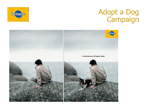
For this Slide Design project, I decided to create an ad that would fit in with the Pedigree Adopt a Dog campaign. The intended audience would be men and women aged 18 and up looking to adopt a dog or have a new companion in their life.
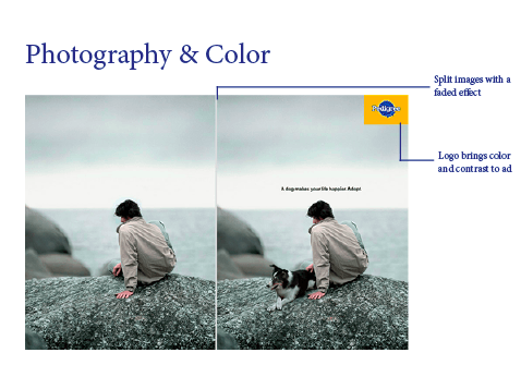
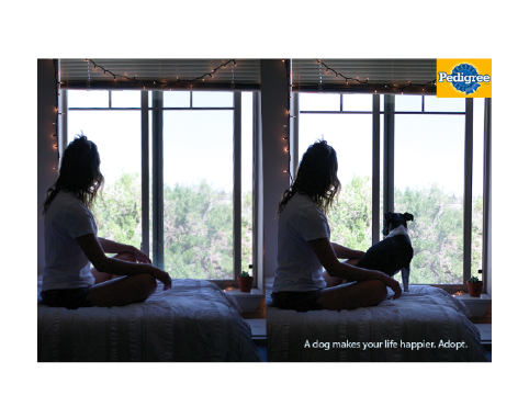
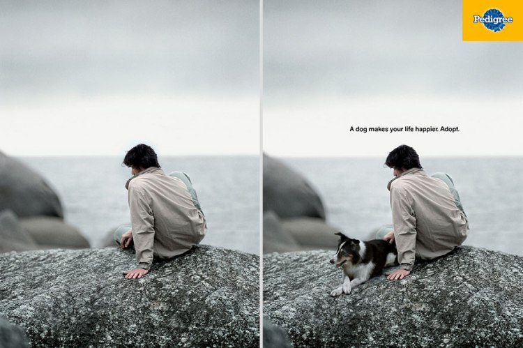
For the design, I decided to continue with the original scheme from my reference ad. The images used not a lot of color and faded images. This kind of design appeals to the chosen demographic because the look is sophisticated and not overwhelming but still leaves an impression with the use of before and after images.
Slides


Design Analysis
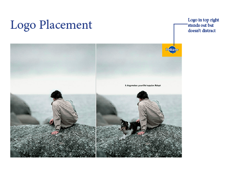
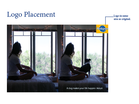
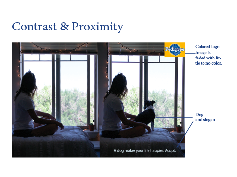
For the placement of the logo, having it in the top right corner allows for the logo to be easily located but it also doesn’t distract from the rest of the ad. In the photos, there isn’t a lot of color and the images have a faded effect. The logo is the main source of color in both ads which adds contrast between the photos and the logo. The colors are blue and yellow which are a part of a triad, making them more visually pleasing.
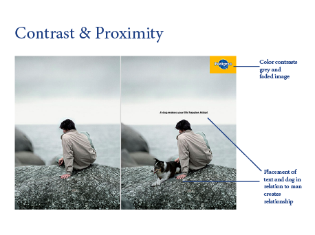
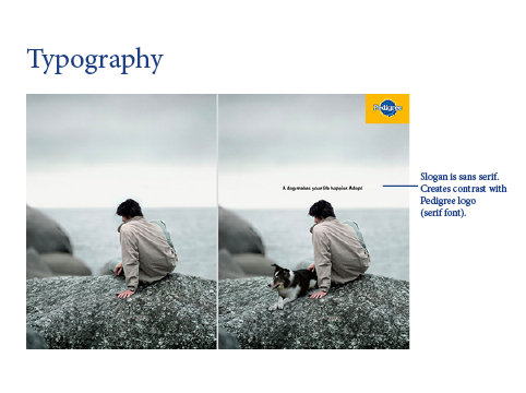
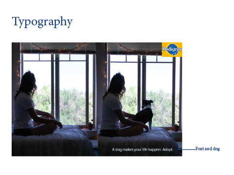
The proximity between the slogan, the dog and the person in the image creates a relationship between those elements. For the typography used, the slogan is done in a sans serif font. This creates contrast that’s visually pleasing between the slogan and the logo because the logo uses a serif font.
Conclusion
The design principles implemented in the new ad emulate the original ad by using before and after photos that have a faded appearance. Using contrasting typography between the slogan and the logo adds to the appeal of the ad by creating contrast that is visually pleasing. The pop of color created by the use of the logo makes the ad memorable but not overbearing with overuse of colors.
Photography Attribution
Original Ad by Pedigree
Photos used for new ad by Samantha Vanderwalker Photography